First of all, I agree with everyone that your gallery is most
impressive. However, as a web designer, I have to give some
constructive criticism. Sorry if it sounds like I'm
complaining; I only mean to point out a usability
issue.
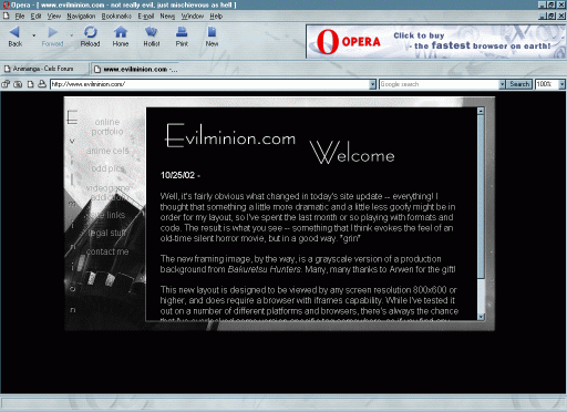
On a 800x600 monitor, your site looks like it'd do
well. But at higher resolutions, there's a lot of unused
space. The attached screenshot shows what I mean - it was taken
at 1024x768. At higher resolutions it's even worse. This is
not a critical problem, but it raises several points. One is
that users with higher resolutions are used to being able to
see more of a page than a half screen. I for one felt like the
content was unnecessarily crammed into a small box floating
in the middle of the page. There are also the issues of the
content scrollbar not being along the right edge of the
screen, limited space for content in a fixed-size IFRAME, and
browsers that do not support IFRAME's (Netscape 4.X just
shows an empty box!).
I do hesitate to criticise such a
good-looking design. The site looks extremely professional
and polished. Unfortunately, many sites are polished for
graphics and not usability. For example, the leftnav looks
artistic, but the grey leftnav text is difficult to read over
the greyscale background.
Like I said, I don't want to
criticise, especially when you're under the weather, but
usability design is what I do, so please consider this free
consulting that you can take or leave out with the trash.
^_^
If you are interested in suggestions, I believe the
same overall effect of your site could be reproduced with
ordinary frames, although the border around the content
might have to be a solid color or tiling image instead of the
cel border it is now. I just don't know if IFRAMES are standard
enough for primetime - do you want to leave out all Netscape 4.X
users?
Anyway, hope this feedback was helpful, or at
least mildly interesting. Either way, your collection
remains an inspiration to all us Slayers fans!
Xanthix |